Creating Your Data Science Portfolio
R
Data Science
Data Visualisation
Show + Tell
Meetup Description
Creating a data science portfolio can help you to develop your skills, and well as showcase them to the wider world. However, getting started on making your portfolio can feel like a huge task. In this talk, Nicola discussed how she used #Tidy Tuesday to gradually build an R portfolio.
We ran through an example of a #TidyTuesday contribution, including:
downloading data
initial data exploration
creating and styling your plots
sharing your data visualisations and code
…..and just like that, you have a portfolio!
Creating your Data Science Portfolio
Slides, code and link available here.
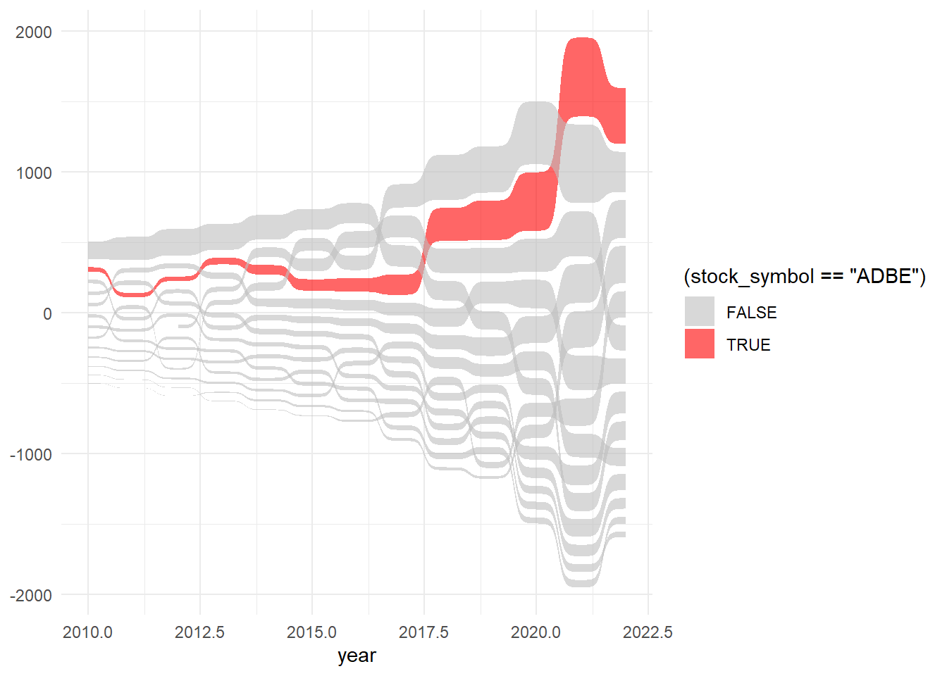
The session used the Big Tech Stock Prices from Tidy tuesday to kick start the portfolio.
Load data:
#load the data set

big_tech_stock_prices <- readr::read_csv('https://raw.githubusercontent.com/rfordatascience/tidytuesday/master/data/2023/2023-02-07/big_tech_stock_prices.csv')
Data wrangling:
library(tidyverse)

library(lubridate)

plot_data = big_tech_stock_prices %>%

mutate(year = year(date)) %>%

group_by(stock_symbol, year) %>%

summarise(open = mean(open, na.rm = TRUE)) %>%

ungroup() %>%

filter(year <= 2022)
Make a basic line chart:
ggplot(plot_data,

aes(x = year, y = open, colour = stock_symbol)) +

geom_line()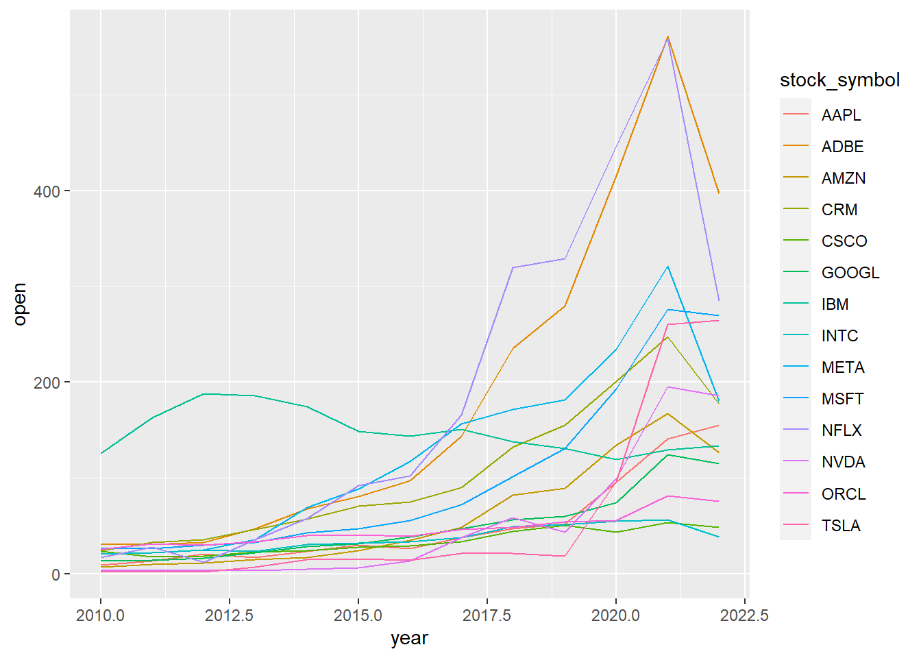
Try a sankey plot:
library(ggsankey)

ggplot(plot_data,

aes(x = year, value = open, node = stock_symbol,

fill = (stock_symbol == "ADBE"))) +

geom_sankey_bump(colour = "transparent",

alpha = 0.6) +

scale_fill_manual(

values = c("grey", "red")

) +

theme_minimal()