Creating Your Data Science Portfolio

Meetup Description
Creating a data science portfolio can help you to develop your skills, and well as showcase them to the wider world. However, getting started on making your portfolio can feel like a huge task. In this talk, Nicola discussed how she used #Tidy Tuesday to gradually build an R portfolio.
We ran through an example of a #TidyTuesday contribution, including:
downloading data
initial data exploration
creating and styling your plots
sharing your data visualisations and code
…..and just like that, you have a portfolio!
About The Speaker
Nicola Rennie is a statistician and data scientist, passionate about using R to solve problems. She currently works as a Data Scientist at Jumping Rivers, having previously completed her PhD in statistics and operational research at Lancaster University where she researched the detection of demand outliers in collaboration with Deutsche Bahn, Lufthansa, and Swiss Airlines.
Contact Nicola @
Creating your Data Science Portfolio
Slides, code and link available here.
The session used the Big Tech Stock Prices from Tidy tuesday to kick start the portfolio.
Load data:
#load the data set

big_tech_stock_prices <- readr::read_csv('https://raw.githubusercontent.com/rfordatascience/tidytuesday/master/data/2023/2023-02-07/big_tech_stock_prices.csv')
Data wrangling:
library(tidyverse)

library(lubridate)

plot_data = big_tech_stock_prices %>%

mutate(year = year(date)) %>%

group_by(stock_symbol, year) %>%

summarise(open = mean(open, na.rm = TRUE)) %>%

ungroup() %>%

filter(year <= 2022)
Make a basic line chart:
ggplot(plot_data,

aes(x = year, y = open, colour = stock_symbol)) +

geom_line()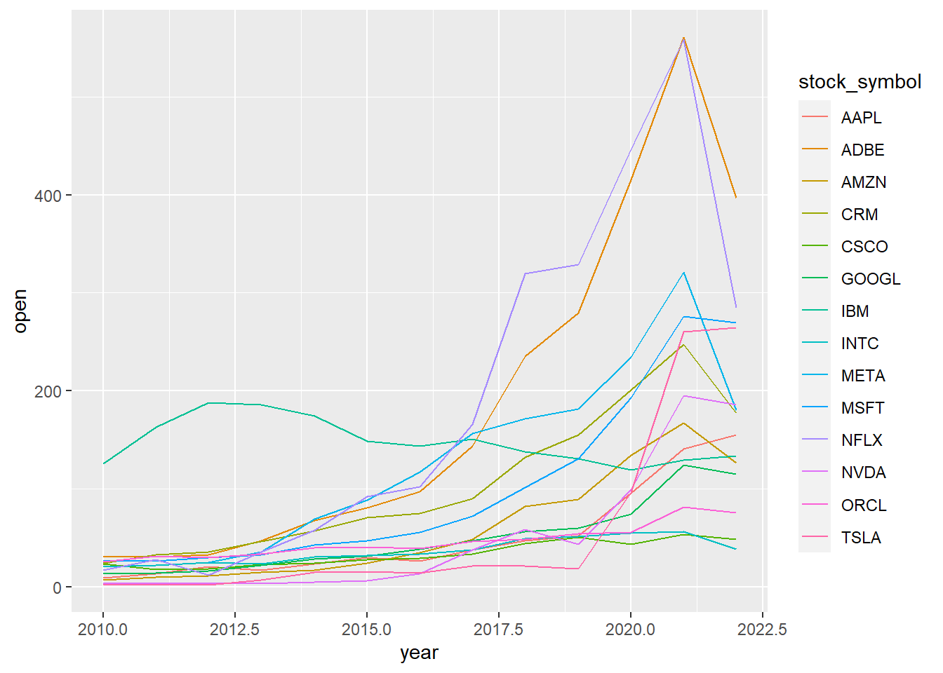
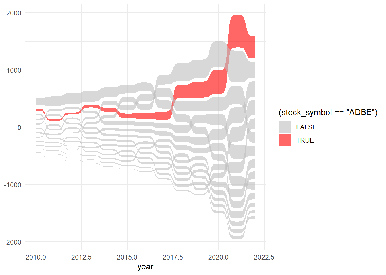
generated basic line chart Try a sankey plot:
library(ggsankey)

ggplot(plot_data,

aes(x = year, value = open, node = stock_symbol,

fill = (stock_symbol == "ADBE"))) +

geom_sankey_bump(colour = "transparent",

alpha = 0.6) +

scale_fill_manual(

values = c("grey", "red")

) +

theme_minimal()
Resources
For ideas on how to create plots, Tidy Tuesday repository is a good place to look at.
YouTube Link
Watch the recording of the meetup session and subscribe to the R-Ladies Gaborone channel and get notifications to new videos uploaded.
Happy Learning